About the project:
ENG
Refresh visual identity: Latino Talent Agency
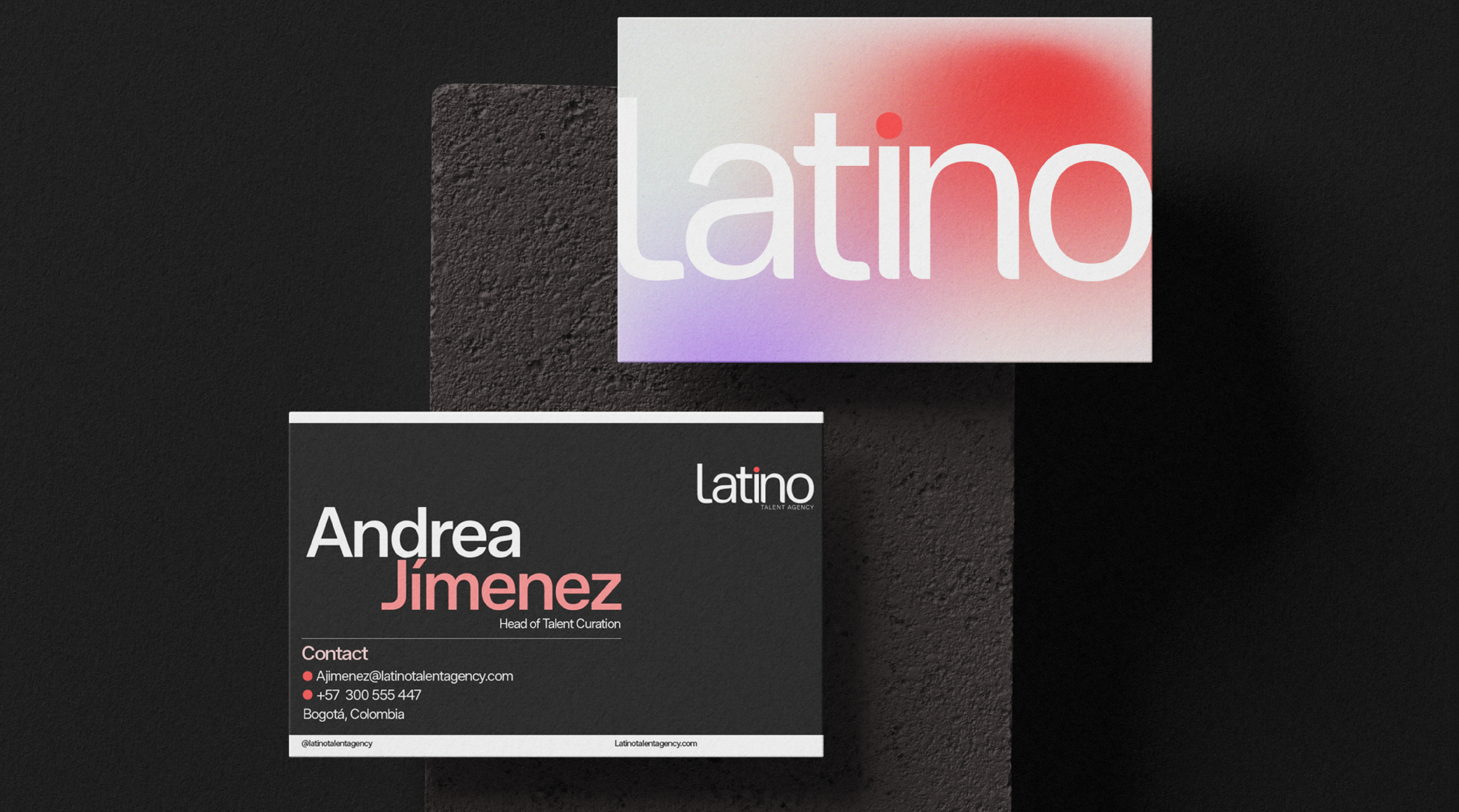
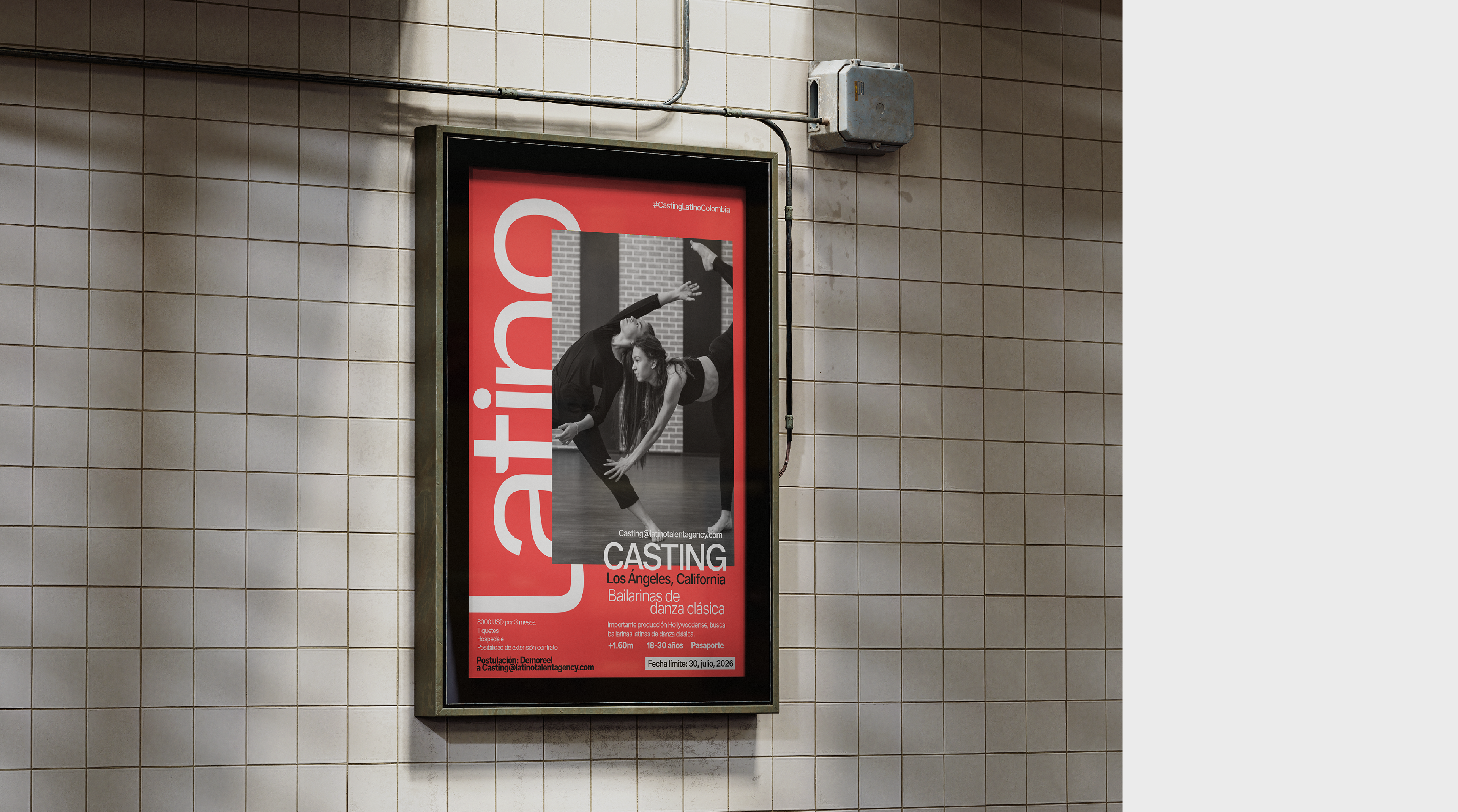
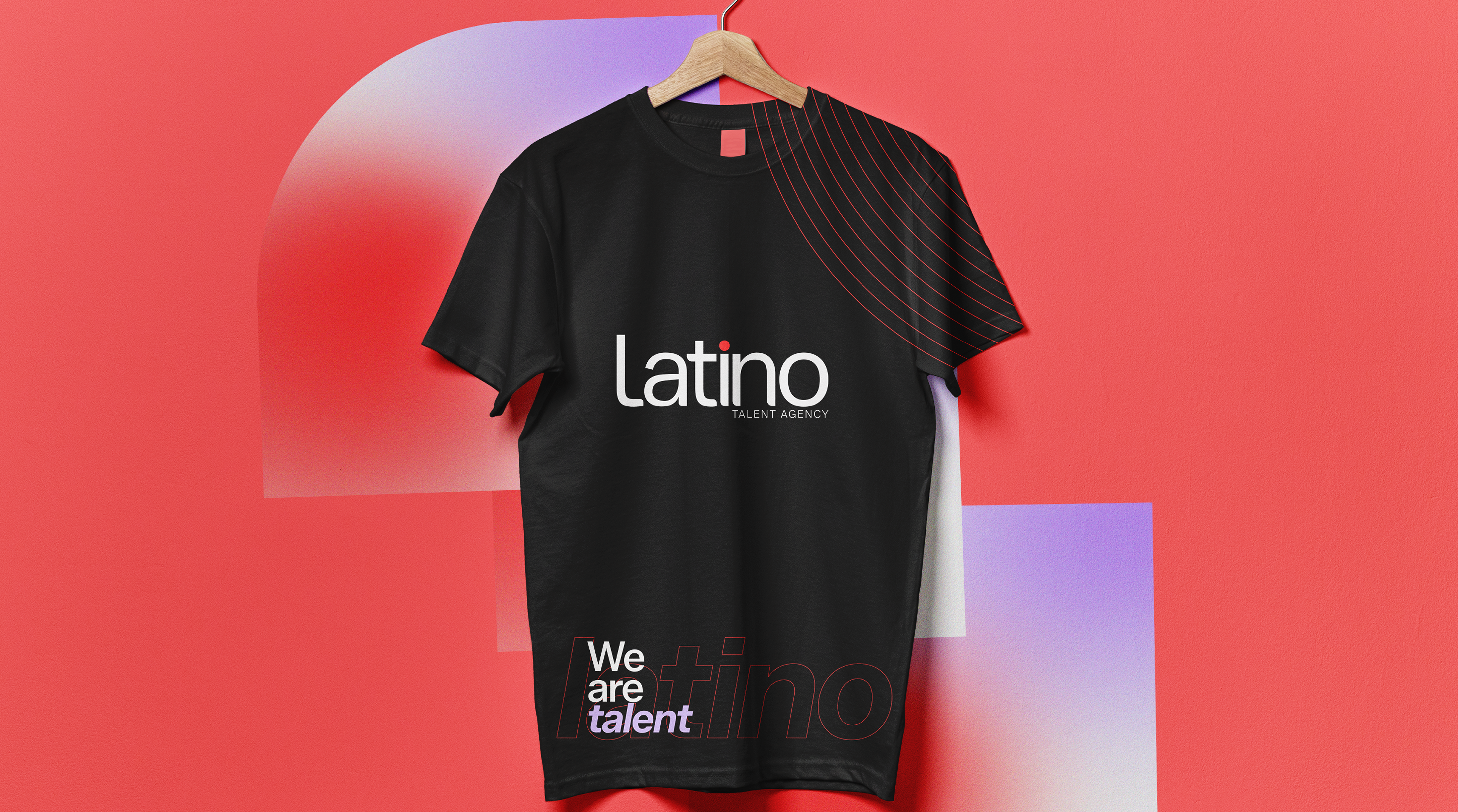
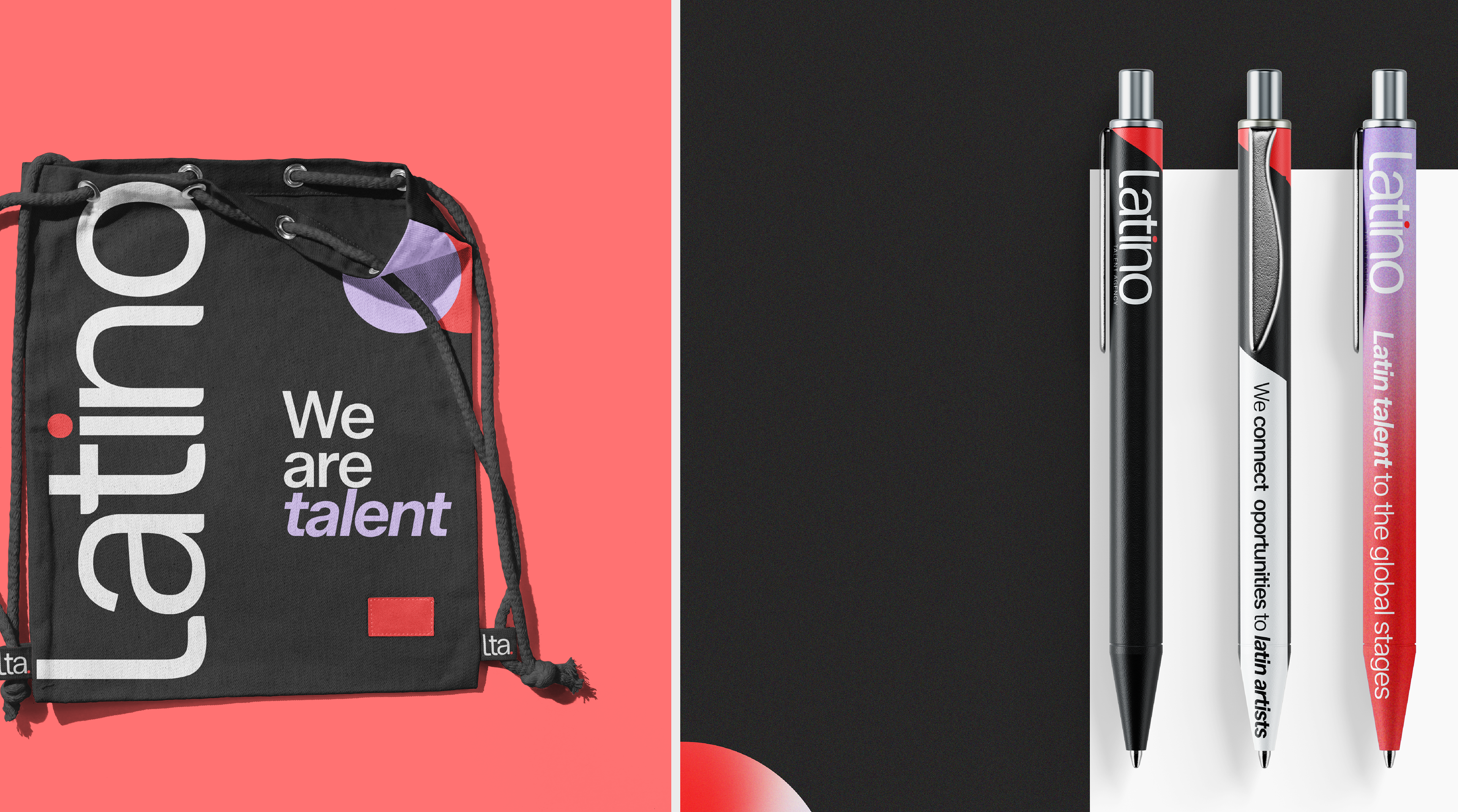
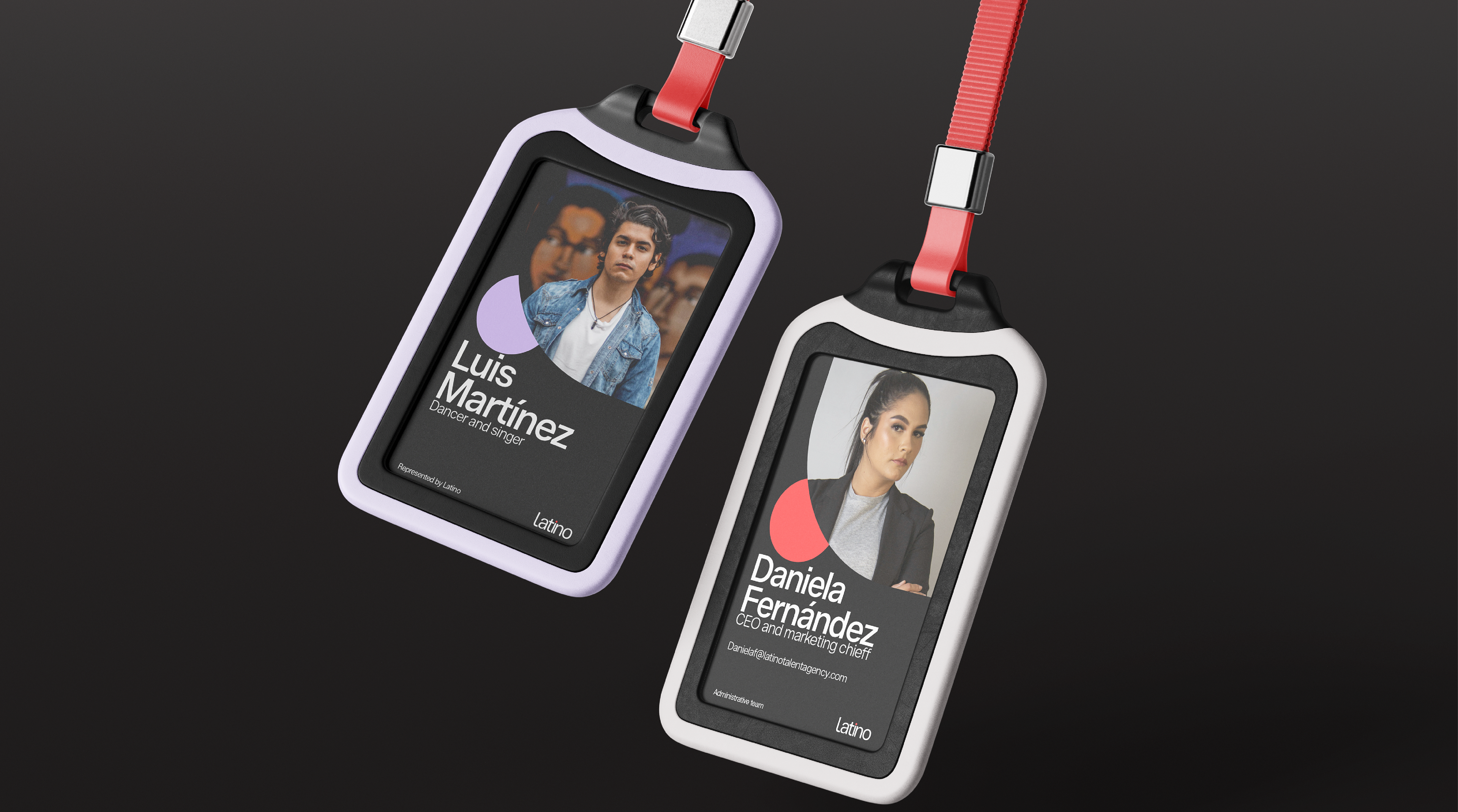
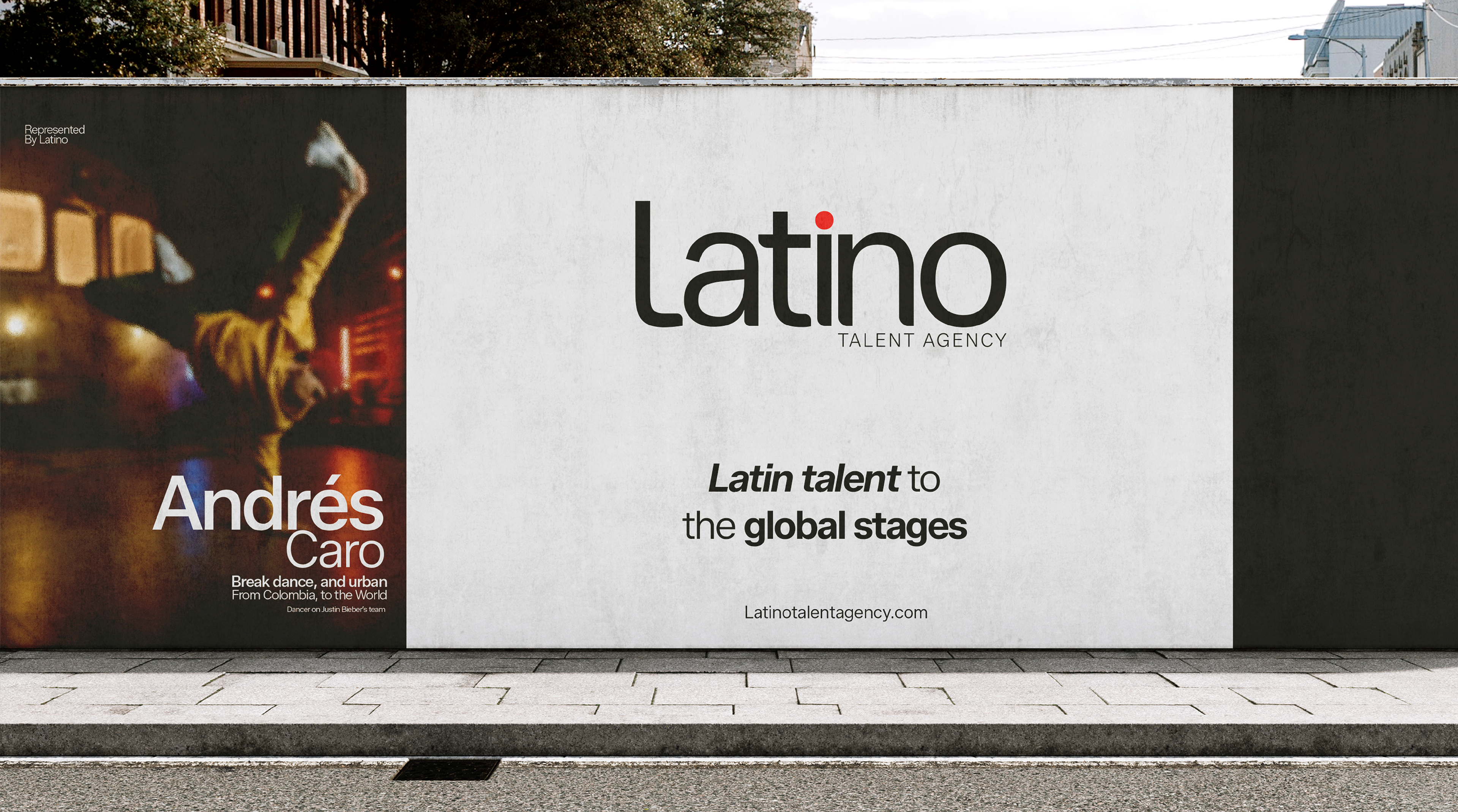
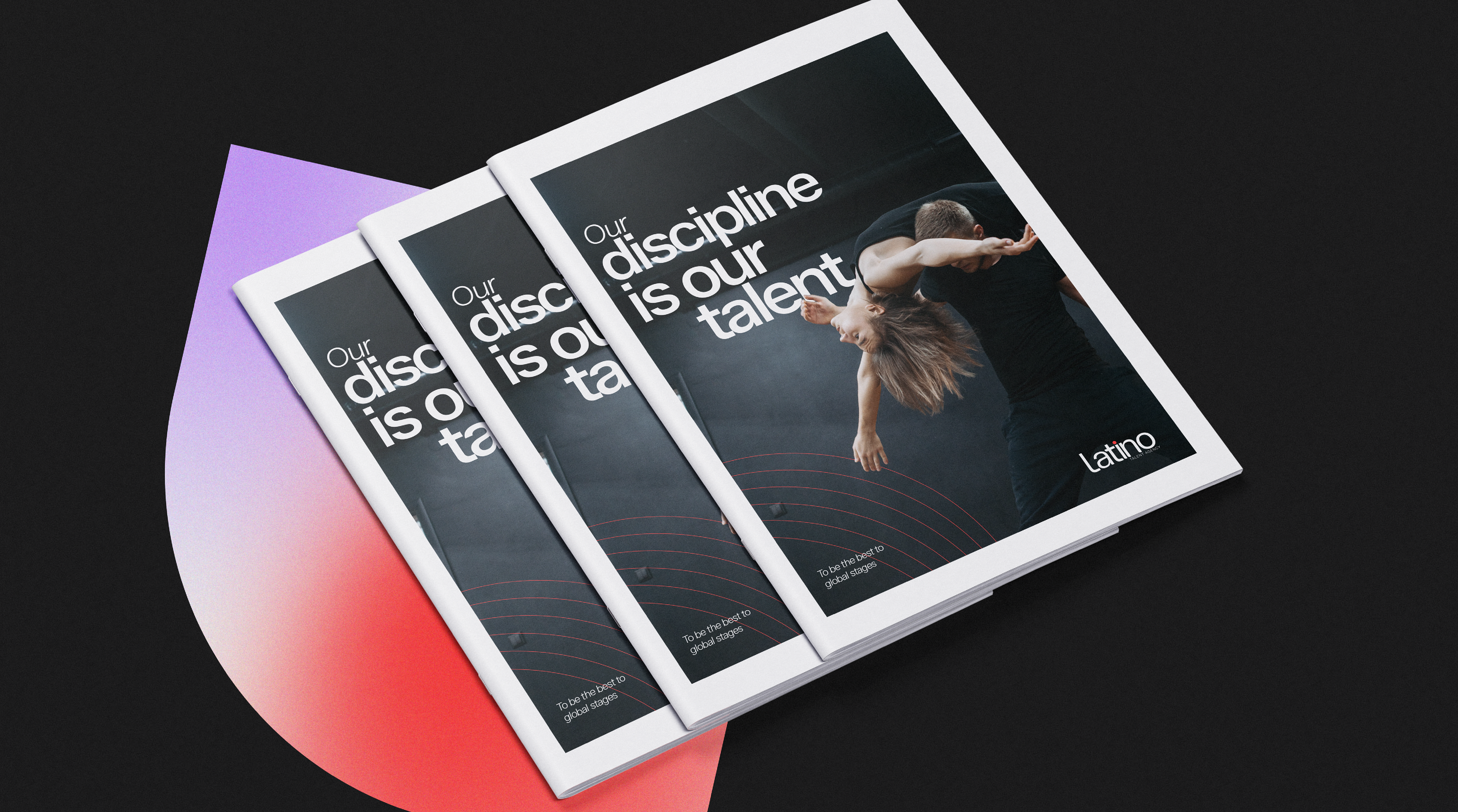
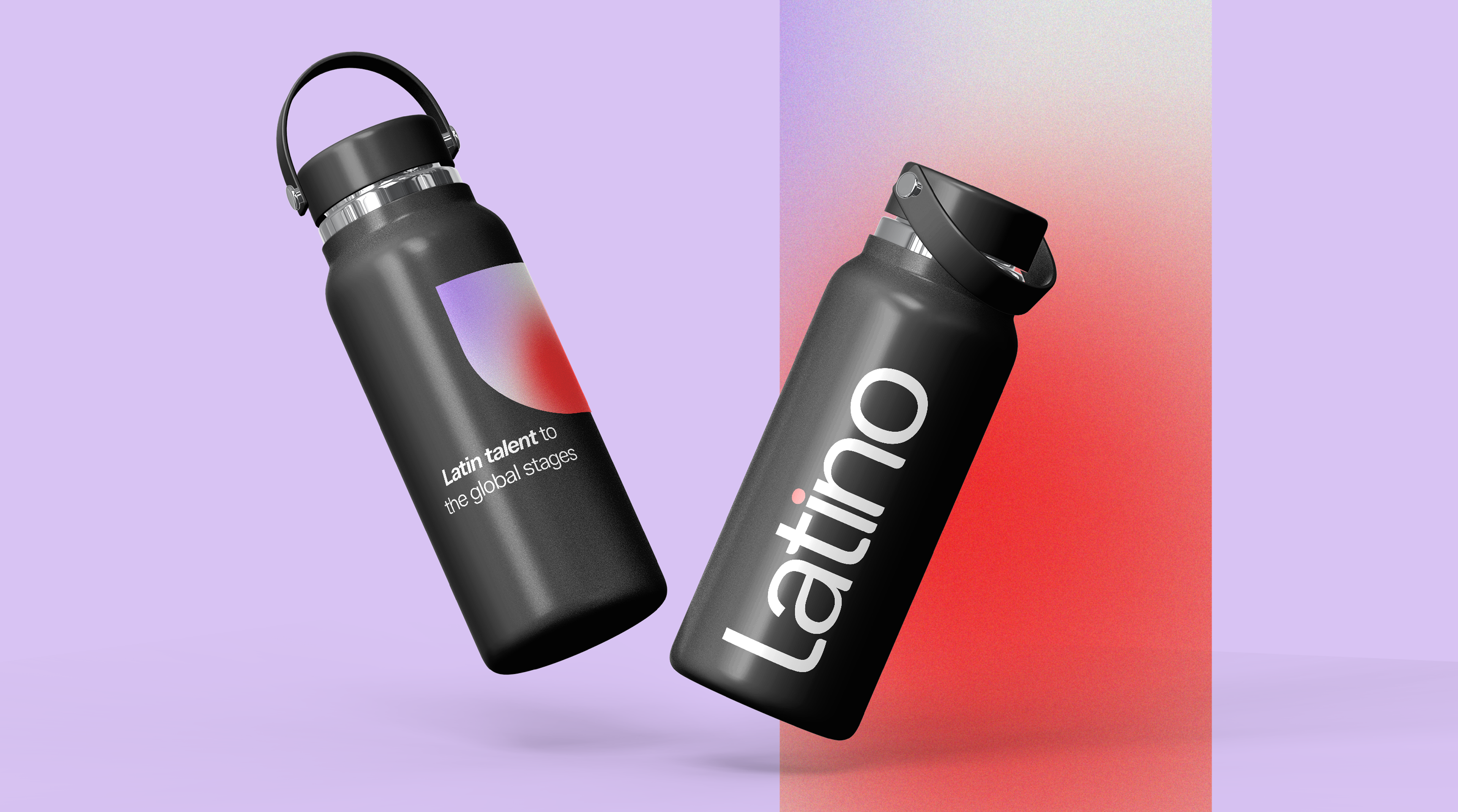
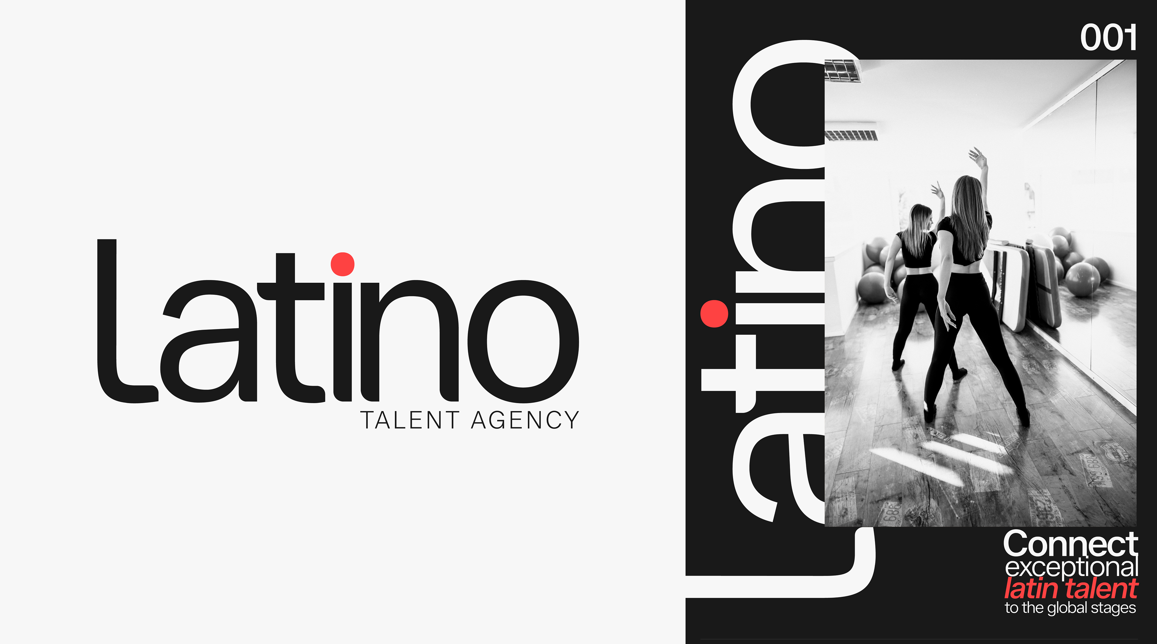
Following an internal restructuring, the agency's previous identity had become obsolete. Over-ornamentation, heavy typography, and a cliché multicolored concept caused visual saturation and hindered brand recognition. The challenge was to realign the brand with its corporate values through an elegant, minimalist, and highly versatile visual system optimized for both digital and print platforms.
The typography evolved into a clean sans-serif family, while the primary palette shifted to refined cream and dark tones that ground the brand with discipline and sophistication. In contrast, vibrant coral and purple serve as accents to project the energy of dance. The result is a premium, highly recognizable, and strategically driven brand.
ESP
Refrescamiento identidad visual: Latino Talent Agency
Tras una reestructuración interna, la identidad de Latino Talent Agency resultaba obsoleta: su exceso de ornamentos, tipografía pesada y un concepto multicolor saturaban la marca, limitando su reconocimiento. El desafío fue alinearla con sus verdaderos valores empresariales mediante un sistema visual elegante, minimalista y de alta versatilidad, optimizado tanto para plataformas digitales como impresas.
La tipografía evolucionó a una familia sans-serif limpia, mientras que la paleta principal adoptó tonos crema y oscuros que aportan disciplina y sofisticación. Como contraste, el coral y el púrpura actúan como acentos vibrantes que proyectan la energía de la danza. El resultado es una identidad premium, funcional y con un propósito estratégico claro.